PRODUCT DESIGN
FULL TIME WORK
Partner Rating: Bringing Partner Quality to a Wego.com's Price-Driven Experience
Company
Wego.com
Timeline
May - Aug 2025
Role
Product Designer
Tools
Figma
First scoped in 2022 and shelved, Partner Rating was revived in 2025 in response to a significant year-on-year decline in Wego's Flights Metasearch conversion rate, requiring the team to move fast under a tight timeline.
Partner Rating displays quality scores for booking partners such as OTAs, airlines, and sponsored providers on the flight details page, helping users make more confident booking decisions while giving Wego a way to surface better-performing partners.
As the main designer on this feature, I handled the end-to-end design process, coordinating with the PM, SPM, and engineers across mobile and desktop. I also initiated and maintained a Progress Report to keep iterations documented and handoffs clear.
pROBLEM
100+ Booking Partners, Zero Quality Signals
Wego works with 100+ booking partners, each varying in price accuracy, reliability, and customer service quality. Yet booking options gave users no way to assess these differences.
The only visible information was the partner name and price. Cheaper does not always mean better, but users had no other signals to decide.
High and low-quality partners appeared side by side with no distinction.
This led to uninformed clicks and poor post-booking experiences.
Contributing to a 15% year-on-year drop in conversion rate in 2025.
PROJECT OBJECTIVES
Help users choose who to book with, not just what price to pick.
USER
Stop guessing, start choosing with confidence
Price alone is not enough. Users needed a way to evaluate partner quality before committing to a booking.
BUSINESS
Turn partner quality into a growth lever
Surfacing ratings helps Wego promote better partners, manage underperformers, and build the kind of trust that brings users back.
hOW IT WORKS
Innocent Until Proven Guilty
Each partner starts with a perfect score of 5. Points are deducted based on four factors, so the final score reflects how much trust has been lost, not how much has been earned.
Conversion rate compared to other partners on the same search, measured by percentile ranking
Price accuracy measured two ways: through user reports after visiting a partner site, and through Wego's own price crawler
Complaint volume based on how many users raised issues with a partner
Complaint resolution based on how well and how quickly partners resolved those issues
The formula is designed to always produce a spread of scores. Scores are calculated per device type, and the lowest tier (1 to 2 stars) is hidden from users. In practice, most users see ratings between 3.5 and 5, which became a key finding later in the experiment.
DESIGN DECISION #1
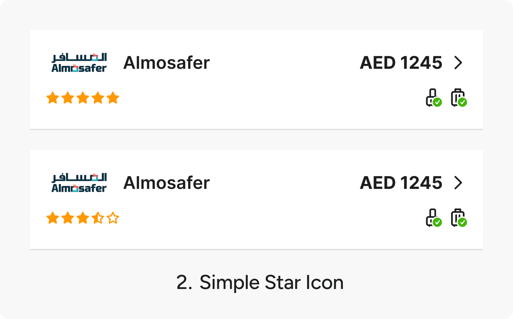
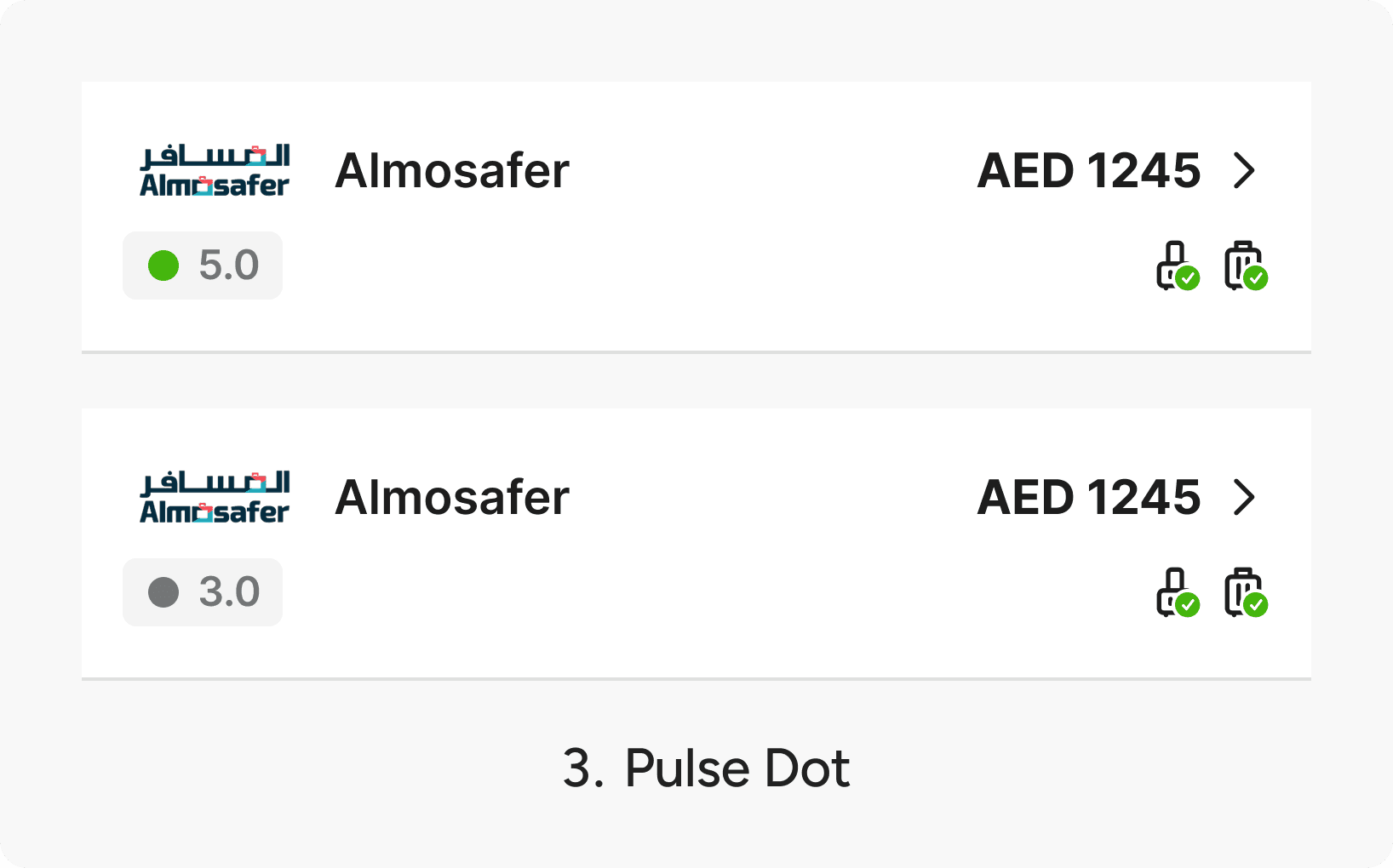
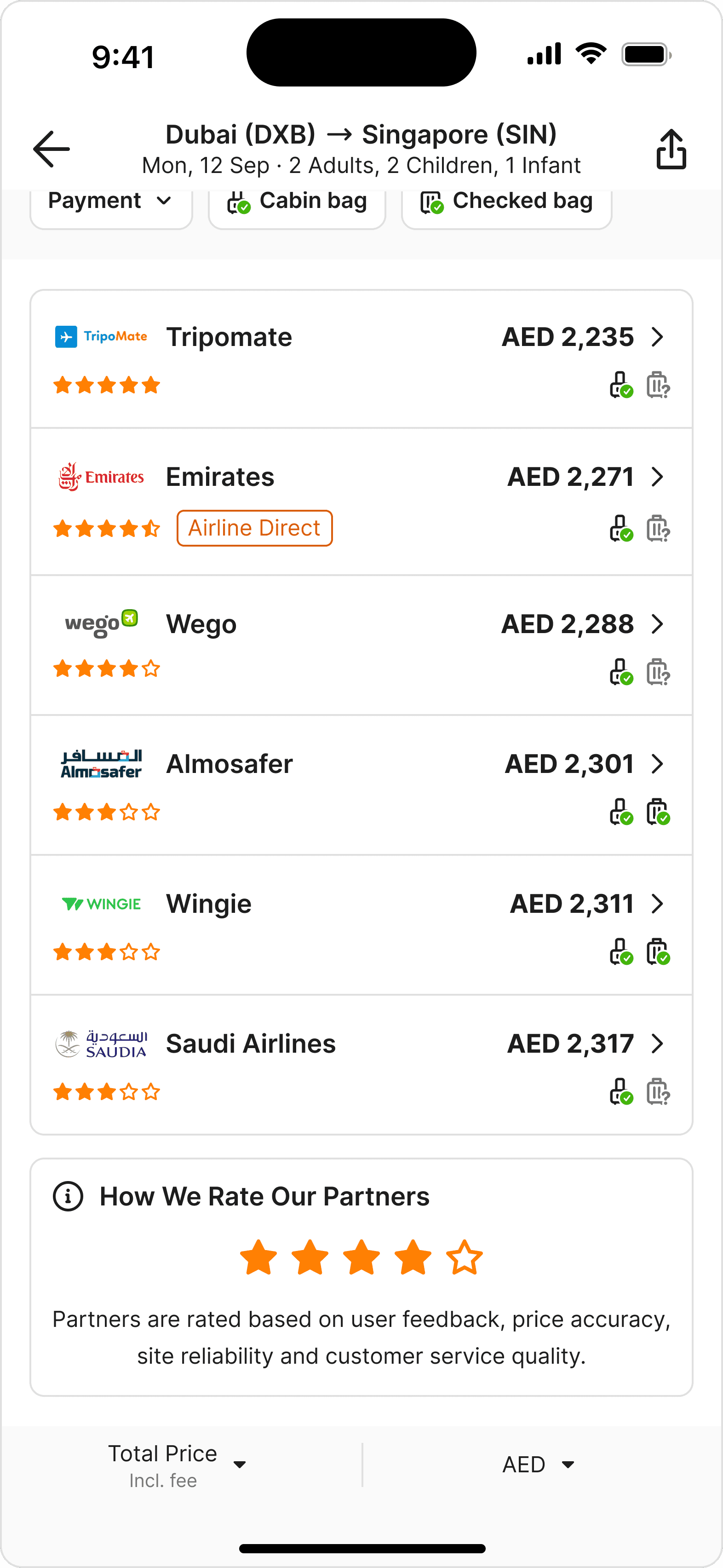
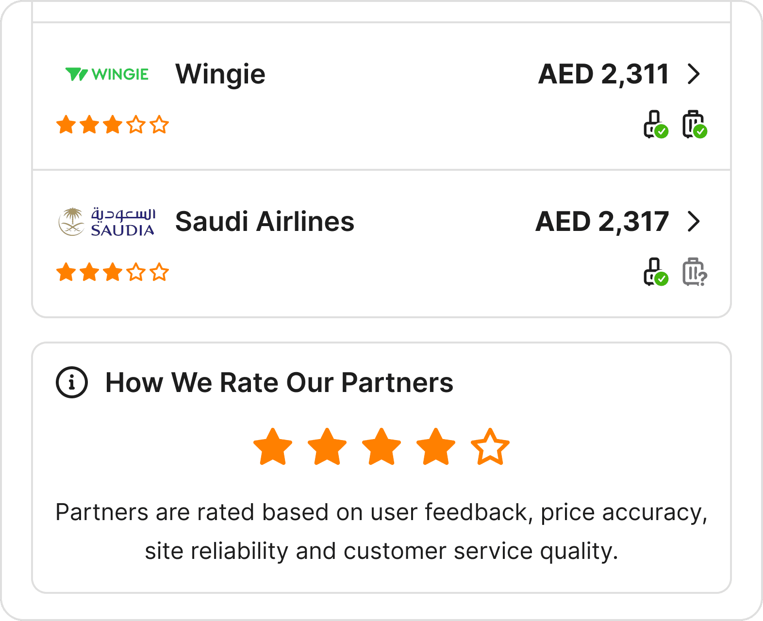
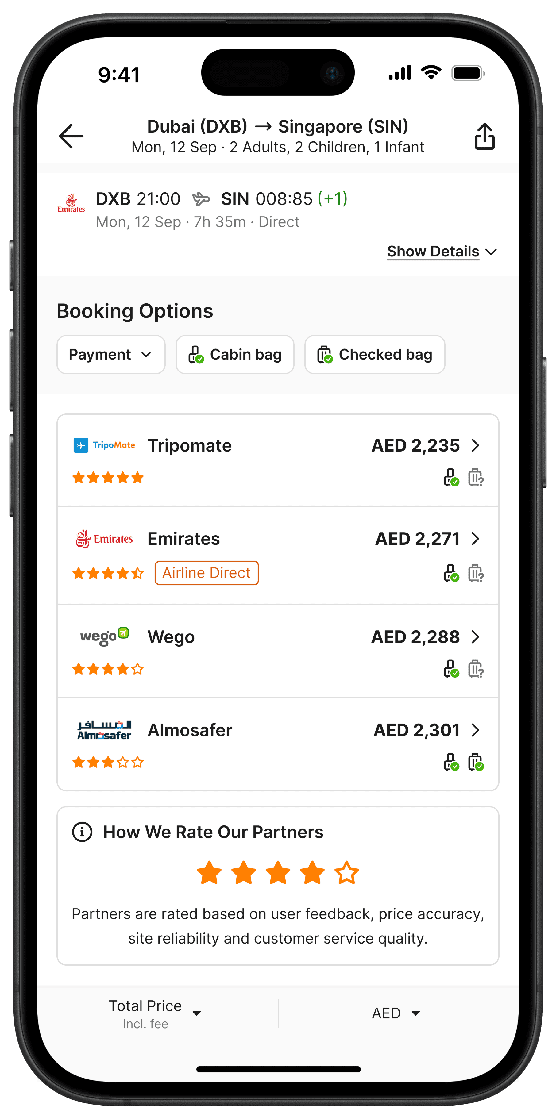
Rating Design
The core principle was to keep the rating minimal. The booking options list already contains many components.
The last thing we wanted was to distract users or slow them down from completing the main action: choosing a partner.
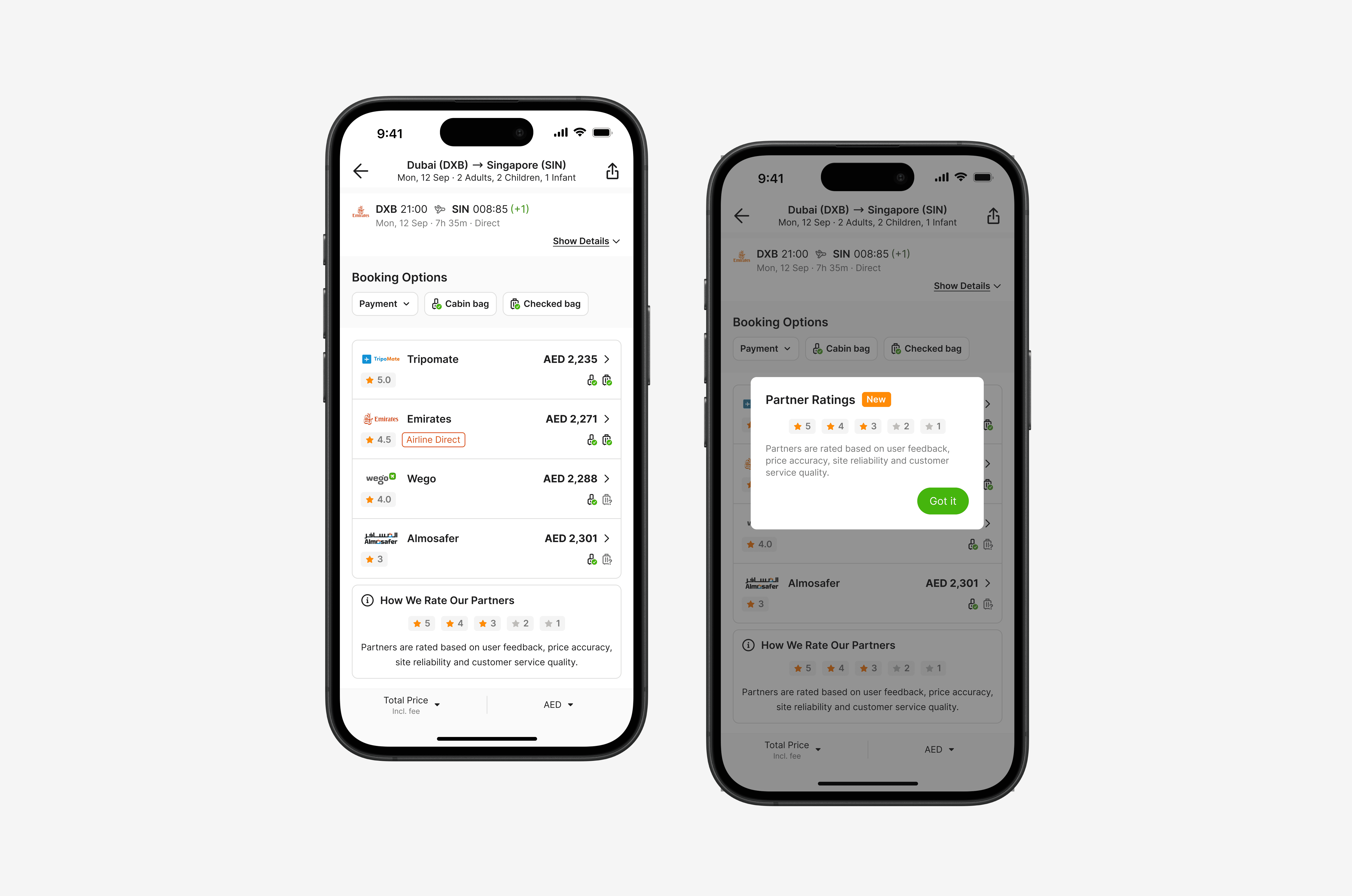
We decided to move forward with option 2. Simple Star Icon for the A/B Testing.
DESIGN DECISION #2
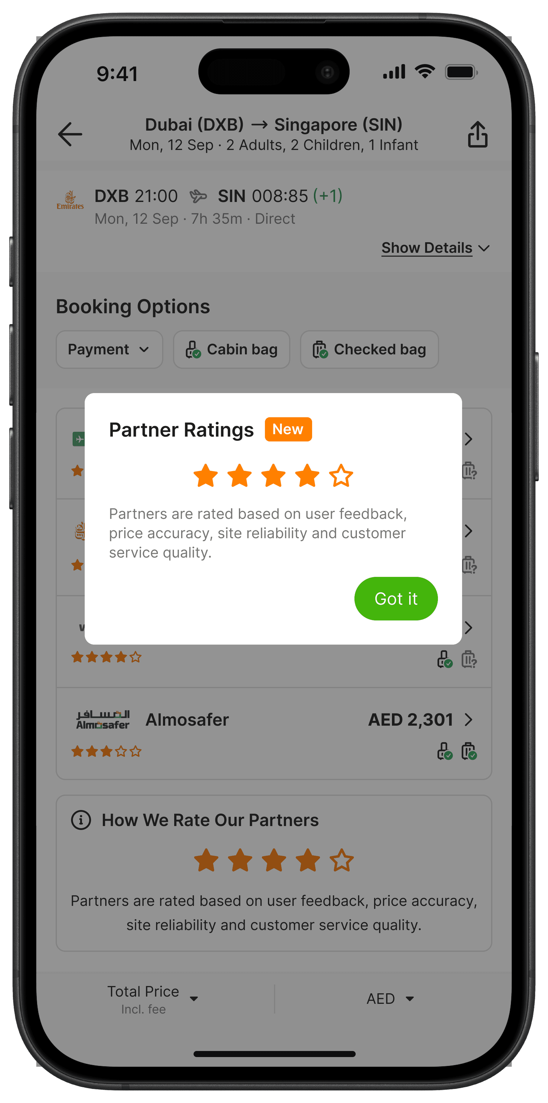
How to Inform Users About Partner Ratings?
Ratings are most commonly associated with user-submitted reviews. This feature works differently, so we needed to communicate that distinction clearly and avoid confusion from the start.
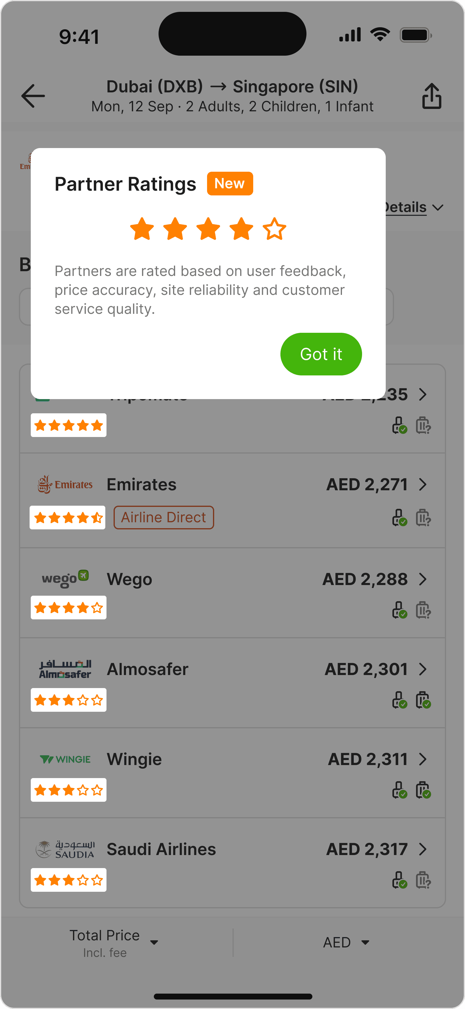
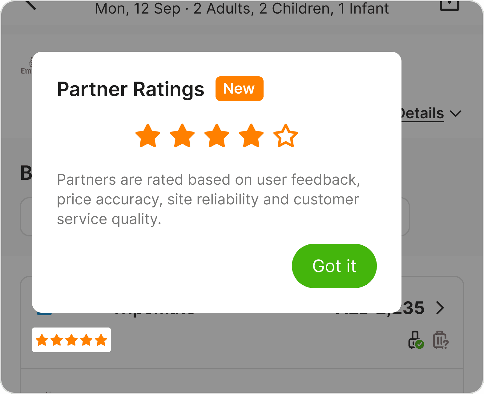


Tap cards to reveal pros & cons
After weighing the pros and cons of each option, we moved forward with the Info Banner for its persistent and low-effort nature, combined with a one-time popup to ensure first-time visibility.
A/B TEST
A Win for Users, A Challenge for Revenue
What Improved
Conversion Rate (CVR) increased, suggesting users were being guided toward better partners
Partners rated 3.5 and above saw the strongest CVR gains
Revenue earned per click (eCPC) rose, meaning users were clicking higher-paying partners
What Declined
Clicks per session dropped, users became more selective
The higher eCPC was not enough to offset the drop in overall clicks
Net result: revenue per user fell
What We Learned
The feature improved CVR but hurt revenue. Users became more selective, which was the goal, but click volume dropped enough to outweigh the gains.
The likely cause: too much at once → star ratings, an onboarding popup, and a footer explanation on a single screen overwhelmed users before they could act.
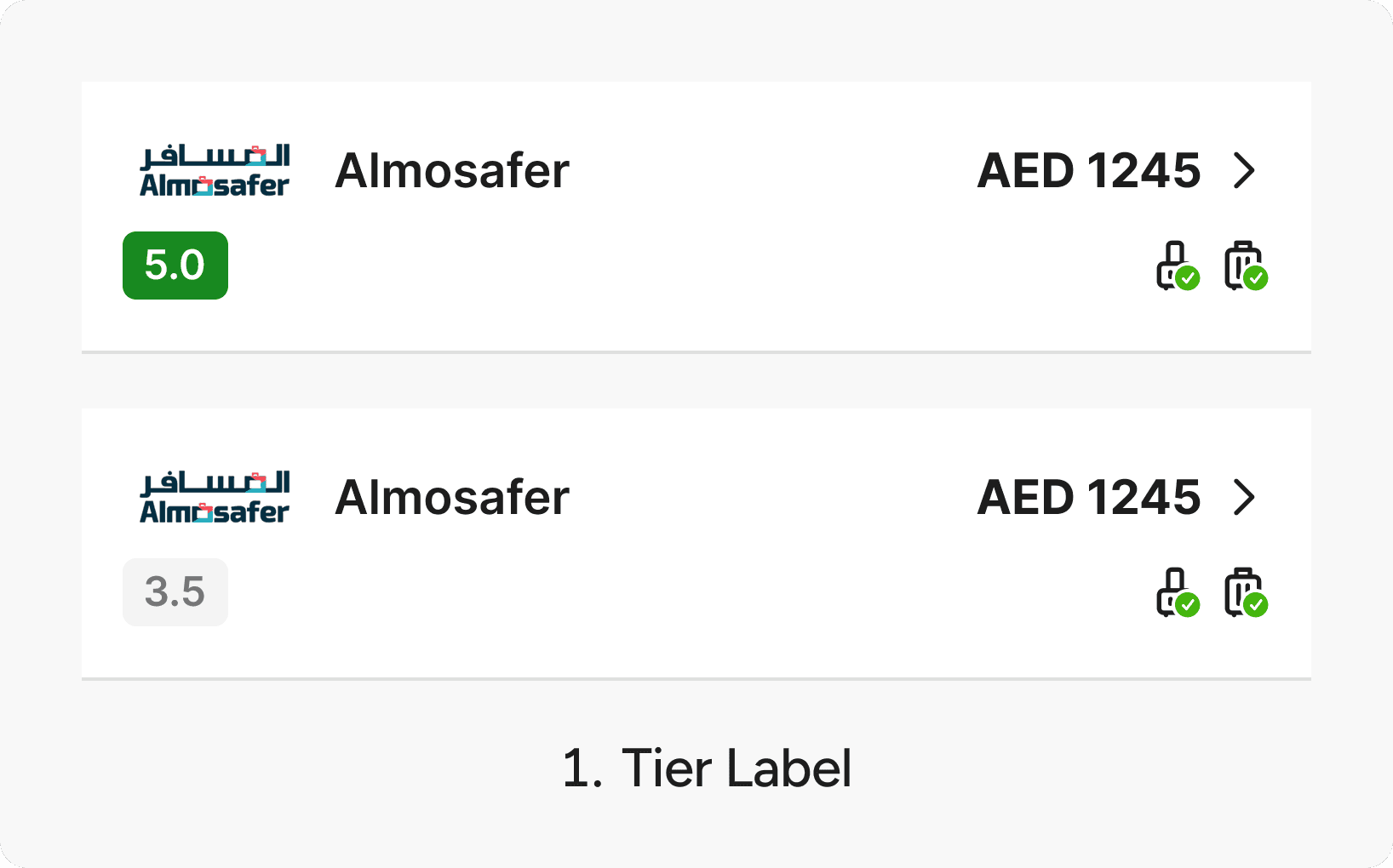
Most fixes point to backend improvements, particularly increasing rating variance across partners. Currently 75% of partners score 4 or 5, leaving little meaningful differentiation for users to act on.
dESIGN IMPROVEMENT
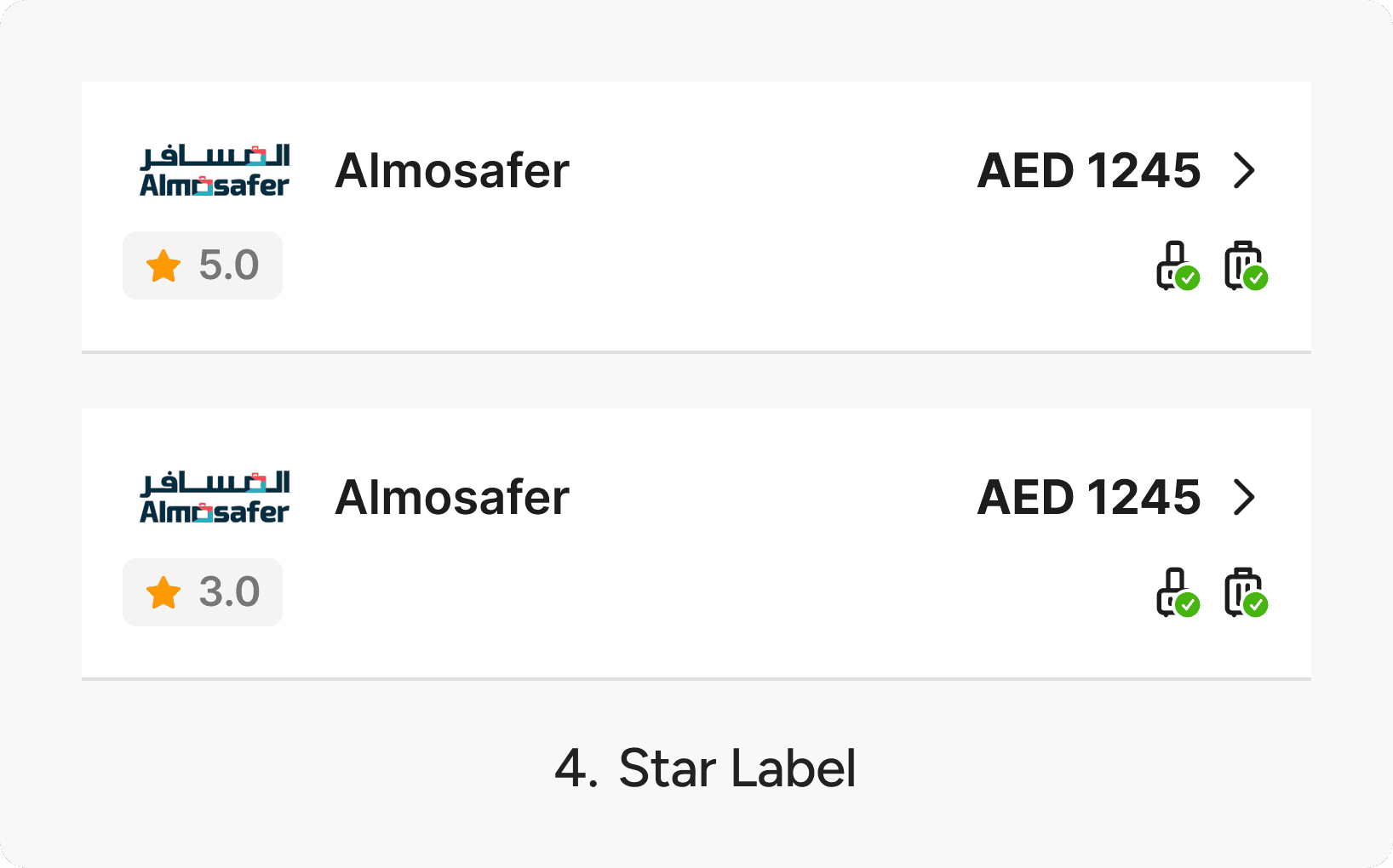
How Do We Say More With Less?
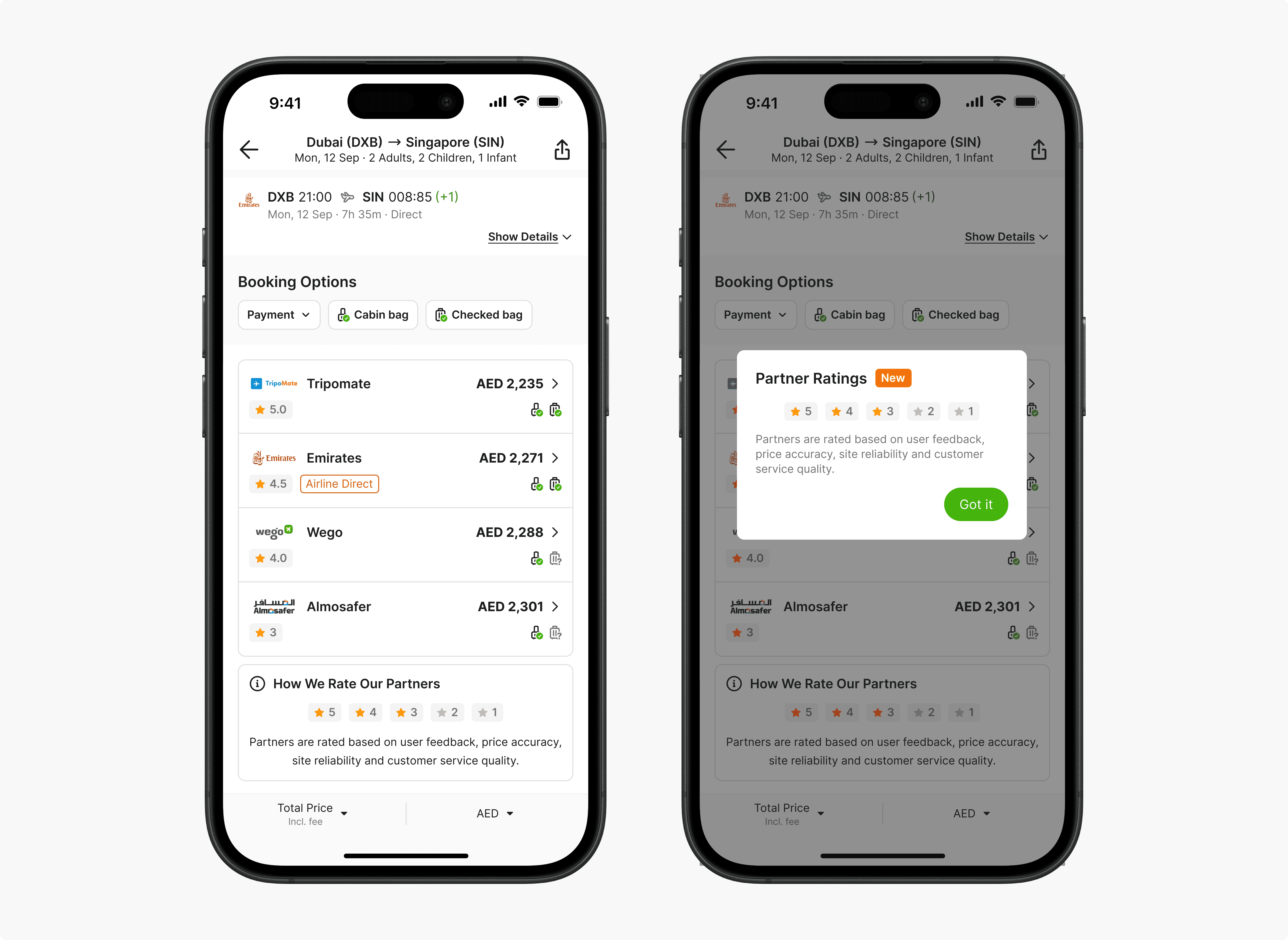
We switched from the Simple Star Icon to the Star Label variant and added a subtle color progression to differentiate high ratings from low ones. The Star Label reduces the need to count individual stars, and the Info Banner can now display the full 1-5 rating scale at a glance without overexplaining it.
This experiment is currently on hold while we figure out a better rating system and calculation to make the scores more meaningful for users.
Lesson Learned
Better decisions, not always better revenue
Better decisions can also mean fewer, more selective clicks, which hurt short-term revenue. Features that improve decision quality need other revenue levers to compensate while trust builds over time.
On a dense page, design by subtraction
The booking options list had no room for more. Future features in this section should start by asking what to remove, not what to add.
Education and conversion pull in opposite directions
An auto-triggered popup teaching users about ratings may have interrupted booking intent at the wrong moment. Opt-in education is worth testing next.
What I Would Do Differently
I would have pushed to define a clearer north star metric before the experiment launched. With CVR and revenue pulling in opposite directions, we lacked a shared definition of success until after the results came in. It would also have been worth thinking upfront about a fallback revenue strategy, such as cross-sell or upsell opportunities, in case the feature hurt short-term volume.
Other Projects

Thank you for reading this far, kudos to you! Let’s together take a deep breath 🍃—and maybe a sip of water 🧊. But hold on, did you say you want more? Lucky you, there's another one below. See you on the next page!