UX DESIGN
UX RESEARCH
SAAS DESIGN
FULL TIME WORK
Medical Records: Transforming Stacks of Forms into a Seamless Health Claim Process in Rey.id Internal Tools
Company
Rey.id
Timeline
Q1 - Q4 2023
Role
Product Designer
Tools
Figma, Figjam
Rey.id is a healthcare-insurtech company that offers reliable and convenient access to health protection and services for over 31,000 users.
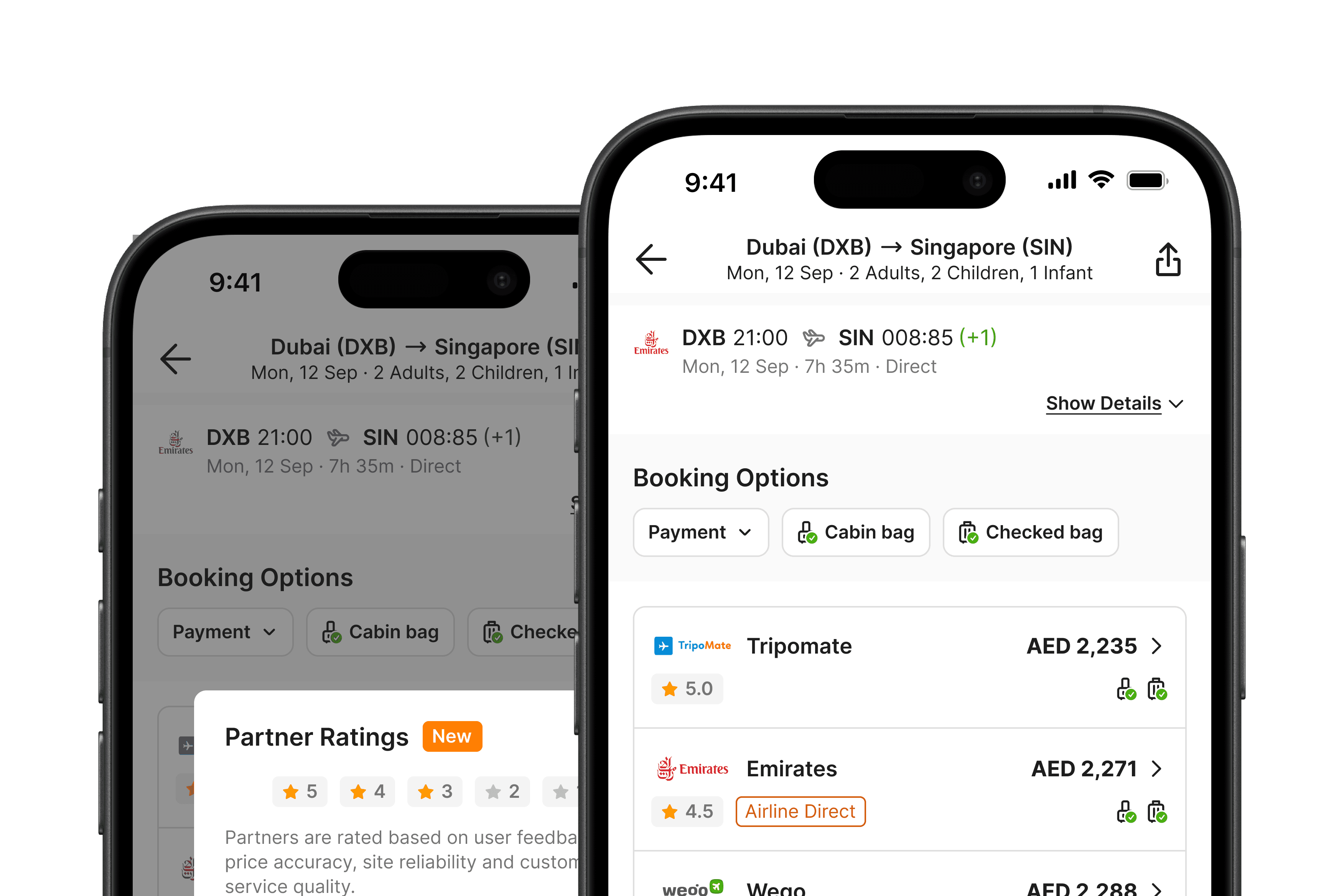
Medical Records is a feature within Rey's Internal tools that enables our team to attend to and document members' activities, starting from requesting a visit to a health facility to processing their claim.
I was the main designer throughout this year-long project redesigning Medical Records, collaborating closely with the product manager, product writer, front-end engineer, and QA engineer.
As the project neared completion, I worked with a UX researcher for user interviews and feedback sessions.
THE PROBLEM
Four out of five health claims are inaccurately assessed by the ReyCare Team, failing to meet the SLA* time requirement of 15 minutes.

Simplified Medical Record Userflow vs. Member's Activities
On average the ReyCare Team member handles about 5 of health claims per shift. They also have to respond to member chats and manage pharmacy deliveries, which can reach up to 20 requests.
*Service Level Agreement (SLA): Time-based deadline for ReyCare Team processing the claim, measured from the moment they receive the final bill until they complete the payment to the hospital.
Project Objectives
Merging two similar features into one
Previously, inpatient and outpatient claims were in separate menus and most details being read-only. We aim to merge these features into one CRUD system.
Help Our Team Help Our Members
While we're at it, we will analyze any problems and pain points in the existing design to come up with better design solutions.
PROBLEM #1
The forms are all stacked up without any clear groups.
Even though it has six phases, the layout lacks clear dividers between the phases and goes too far down
The lack of clear grouping and dividers makes it feel like a never-ending process.
If the team needs to go back to a previous phase, they have to use the revert button. But the layout makes it look like one big form.

PROBLEM 2
Claim calculation and assessment involve frequent context switching.

Monitoring and discharge phase: the location of complex claim assessment
The plain text table is now less effective due to the addition of decision-making functionalities.
The team has to go back and forth between reviewing hospital invoices and inputting data into the system.
They need to manually copy data from invoices and decide on coverage, payment, excess, etc. If done simultaneously, it leads to context switching.

Too much information to check
The team finds it difficult to find frequently referenced information from previous phases.
They prefer asking other team members or in-house doctors for confirmation, leading to delays and uncertainty.

Why should we care the team's cognitive load, confusion, and overall experiences?
Remember, what happens in the internal tools also reflects in the member's app and the claim process.
PROJECT GOAL & DESIGN PRINCIPLES
How might we reduce cognitive load and enhancing the overall experience for the team so that members receive their claim results within the SLA time?
We seek the solutions with these 3 design principles in mind,
Clear and transparent
Clear process separation and transparent phase indicators provide the team a sense of progress, keeping them aware of how far they've progressed and how much remains.
Informatively minimal
Providing the right amount of information at the appropriate places should assist the team without overwhelming them. This approach also helps prevent human errors.
DESIGN DECISION #1
Divide the Entire Process into 6 Pages Based on The Phases
1
Each phase is displayed as a header with the current status for clarity.
We also separate menus not tied to any phase into the "More" menu.
2
Chunk the stack of forms based on context and functionality.
3
Implement a sticky bottom sheet for seamless navigation to the next phase/page. There is also information about the upcoming phase to set the right expectation.

3
Bottom Sheet Variations
In specific phases, multi-layered approval within our team for higher claim amounts or third-party approval is required. Therefore, various states are added to accommodate these specific scenarios.

DESIGN DECISION #2
Let the Team Focus on One Task at a Time - Data Input, then calculation and decision making

Claim assessment workflow grouped into two main sections: data input and calculation table
The complex process is divided into two parts. This allows the team to focus one step at a time, avoiding context switching.
Data Input: Concentrating on copying exactly what is stated in the invoice/bill.
Calculation Table: With all copying completed, this phase involves the necessary calculations and decision-making processes.

Data Input
1
Numbered headers with brief instructions.
2
Integrated PDF/image viewer allows the team to view the uploaded invoice/bill on the side, saving time without opening a separate viewer.
3
After defining expense groups and items, the team can input amounts. The selected group's expenses automatically correspond to the benefit codes from the insurance policy.

Calculation Table
4
Once all data is submitted, it automatically transfers to their respective columns.
5
The team can proceed to calculate approval amounts and make other decisions, such as choosing payment methods and handling excess payments, in the inline editable table.
The table may be overwhelming, but since we cannot simplify the columns further, we enhance ease of navigation across the table by adding microinteractions and visual cues.
Row Hover State

Expense groups from data input as collapsible headers

Sticky columns & rows for easy scrolling and scanning

dESIGN DECISION #3
Important Data Hub
The team frequently refers to previous phase inputs, but not all information is needed. Therefore, we curate only commonly-referenced details.
Curated information is grouped by phase or related topics.
For tabs designated for upcoming phases, disabled/empty states are added, indicating they are yet to be filled out.
REVISIONS
My Ideas for The Next Improvement
Data Input Improvement
Based on recent in-depth interview, the team find it burdensome to create charge groups one-by-one.
Initially, they requested all expense groups to be automatically generated. However, this would lead to new problems when inputting the expense amount due to the extensive and ever-growing list of benefit codes.
My alternative idea: changing the select field type from single to multi-select and placing it upfront.
This way, we address the issue of tedious work while maintaining flexibility for adjustments.
↔️ Move the handle right/left to see before/after
Adding More Visual Cues to Calculation Table
Not all columns in the calculation table need to be filled manually
It also includes columns where the data is transferred from data input and automatically calculated.
To help the team distinguish which columns need to be filled in this table, labels are created as follows, inspired by the shape of bookmarks in real life.

pROJECT IMPACTS
Based on the data, the team's performance has doubled compared to before.
The team successfully processed twice the number of claims within the SLA time requirement (15 min).
The accuracy rate improved significantly from 20% to 80%, with human errors reduced.
↔️ Move the handle right/left to see before/after
What I Learned from This Project
Rolling with Restrictions
Medical Records has numerous restrictions and intricate rules. It took over a week just to grasp its constantly evolving user flow. It's a wild ride where my usual ideas and best practices don't work anymore, and I have to get creative within the system's constraints.
Advocating for Internal Tools is Tricky
It's easy to assume what our colleagues need, but I had to take a step back and communicate directly. Since everyone shared similar assumptions, convincing others of unconventional ideas also required more challenging discussions, where data and prototypes became extremely helpful.
Internal Tools Can Get Overly Technical
Full with machine-like jargon and serial numbers, they become unnecessarily complicated. This project highlighted the importance of achieving a balance between the system's technical requirements and user-friendly design, ensuring the tool is straightforward and easy to use.
Other Projects

Thank you for reading this far, kudos to you! Let’s together take a deep breath 🍃—and maybe a sip of water 🧊. But hold on, did you say you want more? Lucky you, there's another one below. See you on the next page!